

Six weeks ago, we featured a map of Collegetown by a recent alumnus, Ryan Gomez '09. But Ryan is hooked on data presentation and Cornellians, so he asked us if we had any ideas for introducing infographics that he could produce. We suggested that he look at the distribution of students from across the country, to see what areas are the most over/under represented, and provided him with a dataset containing enrollment and demographic information by state. The beautiful result:
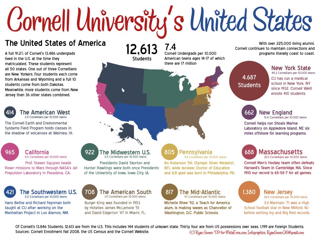
The colored dots represent the student representation of each state/region at Cornell. But what's more interesting is the relative representation -- we would expect a lot of students from California because California is a populous state.
But did you also know there are relatively more students fro California than the American Midwest? For every 10,000 high-school age students in California, 4.5 study at Cornell. But the similar statistic in the Midwest is 2.5.
Perhaps the admissions office should recruit more aggressively in Chicago.
Ryan hopes to continue producing introducing graphics like these for MetaEzra and asks for your input. He writes:
My education is in understanding and modeling statistical trends. My expertise is Collegetown's historical context. My list of sources is long and covers a wide range of Cornell's institutions and my mission is capturing the zeitgeist of our large Cornell family.
So what would you like to see? Email us at editor(at)metaezra.com today!